seaborn.jointplot
译者:Stuming
seaborn.jointplot(x, y, data=None, kind='scatter', stat_func=None, color=None, height=6, ratio=5, space=0.2, dropna=True, xlim=None, ylim=None, joint_kws=None, marginal_kws=None, annot_kws=None, **kwargs)
绘制两个变量的双变量及单变量图。
这个函数提供调用JointGrid类的便捷接口,以及一些封装好的绘图类型。这是一个轻量级的封装,如果需要更多的灵活性,应当直接使用JointGrid.
参数:x, y:strings 或者 vectors
data中的数据或者变量名。
data:DataFrame, 可选
当
x和y为变量名时的 DataFrame.
kind:{ “scatter” | “reg” | “resid” | “kde” | “hex” }, 可选
绘制图像的类型。
stat_func:可调用的,或者 None, 可选
已过时
color:matplotlib 颜色, 可选
用于绘制元素的颜色。
height:numeric, 可选
图像的尺寸(方形)。
ratio:numeric, 可选
中心轴的高度与侧边轴高度的比例
space:numeric, 可选
中心和侧边轴的间隔大小
dropna:bool, 可选
如果为 True, 移除
x和y中的缺失值。
{x, y}lim:two-tuples, 可选
绘制前设置轴的范围。
{joint, marginal, annot}_kws:dicts, 可选
额外的关键字参数。
kwargs:键值对
额外的关键字参数会被传给绘制中心轴图像的函数,取代
joint_kws字典中的项。
返回值:grid:JointGrid
JointGrid对象.
参考
绘制图像的 Grid 类。如果需要更多的灵活性,可以直接使用 Grid 类。
示例
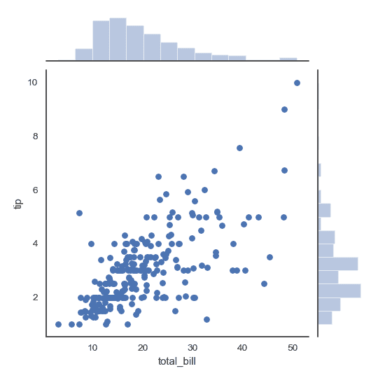
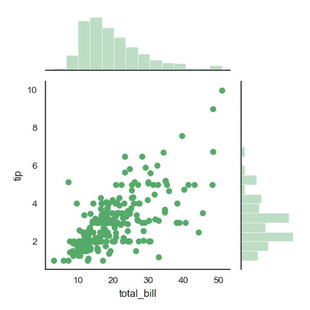
绘制带有侧边直方图的散点图:
>>> import numpy as np, pandas as pd; np.random.seed(0)
>>> import seaborn as sns; sns.set(style="white", color_codes=True)
>>> tips = sns.load_dataset("tips")
>>> g = sns.jointplot(x="total_bill", y="tip", data=tips)
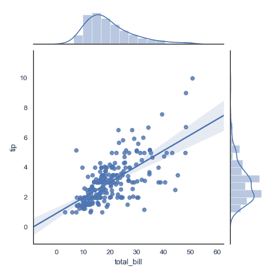
添加回归线及核密度拟合:
>>> g = sns.jointplot("total_bill", "tip", data=tips, kind="reg")
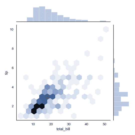
将散点图替换为六角形箱体图:
>>> g = sns.jointplot("total_bill", "tip", data=tips, kind="hex")
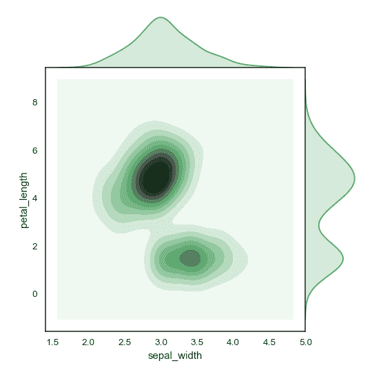
将散点图和直方图替换为密度估计,并且将侧边轴与中心轴对齐:
>>> iris = sns.load_dataset("iris")
>>> g = sns.jointplot("sepal_width", "petal_length", data=iris,
...                   kind="kde", space=0, color="g")
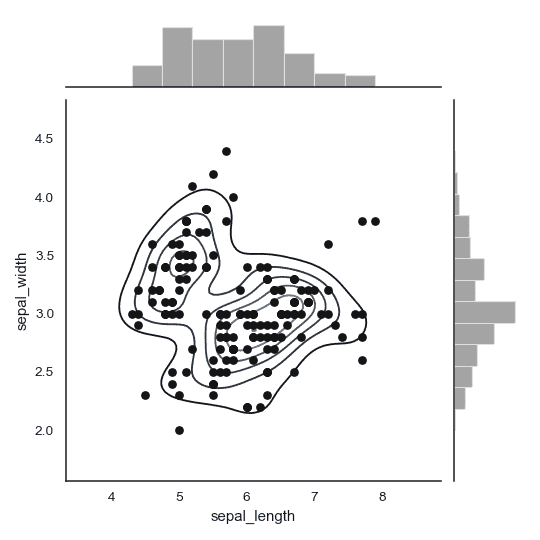
绘制散点图,添加中心密度估计:
>>> g = (sns.jointplot("sepal_length", "sepal_width",
...                    data=iris, color="k")
...         .plot_joint(sns.kdeplot, zorder=0, n_levels=6))
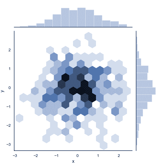
不适用 Pandas, 直接传输向量,随后给轴命名:
>>> x, y = np.random.randn(2, 300)
>>> g = (sns.jointplot(x, y, kind="hex")
...         .set_axis_labels("x", "y"))
绘制侧边图空间更大的图像:
>>> g = sns.jointplot("total_bill", "tip", data=tips,
...                   height=5, ratio=3, color="g")
传递关键字参数给后续绘制函数:
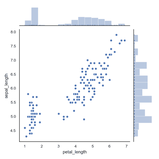
>>> g = sns.jointplot("petal_length", "sepal_length", data=iris,
...                   marginal_kws=dict(bins=15, rug=True),
...                   annot_kws=dict(stat="r"),
...                   s=40, edgecolor="w", linewidth=1)